
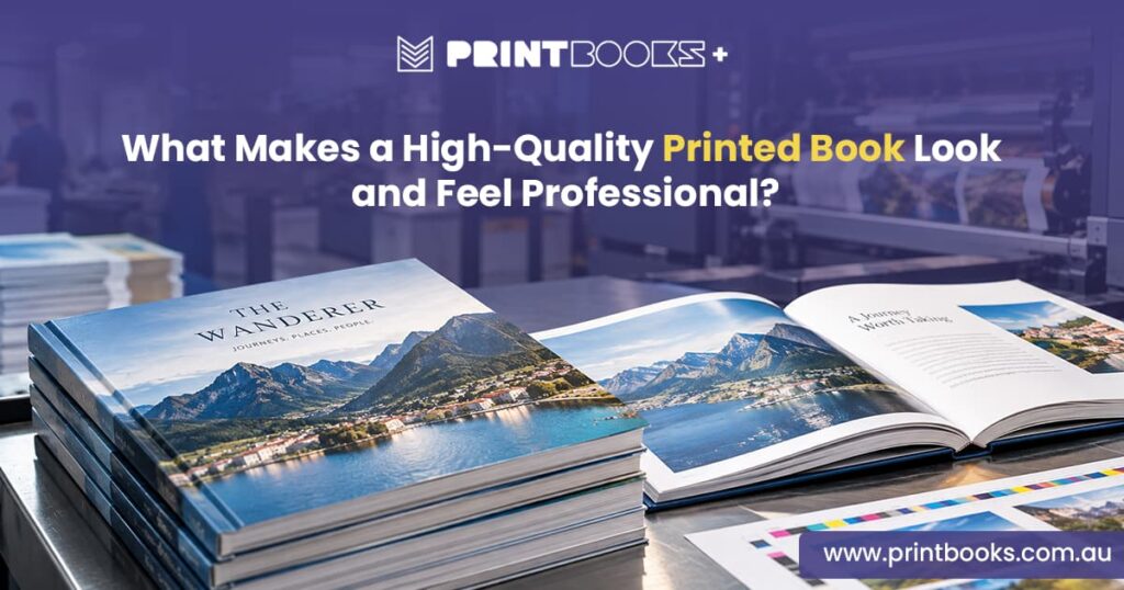
A professionally printed book is about more than just getting words and images onto paper. How it’s produced shapes what readers think of the content, the author and the organisation behind it.
Think about books you’ve picked up in a shop, or ones a business has handed you. Some feel substantial the moment you pick them up. Others feel a bit off before you’ve even opened the cover. Usually that comes down to a handful of small things — paper, colour, typography, image quality, binding, finishing.
Novel, cookbook, photo book, business publication, workbook, annual report — whatever it is, getting these details right makes a real difference.
Start With Professional Artwork and Layout
Everything starts with well-prepared artwork.
No printer, however good, can fully rescue poorly prepared files. Text needs to be properly aligned, images need to be print-ready, and the layout needs to hold together from the first page to the last.
Margins, spacing, headings, page numbers, chapter layouts — small inconsistencies in any of these get a lot more obvious once they’re actually printed.
The cover deserves extra attention since it’s usually the first thing anyone sees. Clear hierarchy, the right typography, well-placed images — get those right and the book feels considered before a single page is turned.
Check your files meet the printer’s requirements and that every page is actually complete before you send anything off.
Choose Paper That Suits the Book
Paper is one of the first things a reader physically notices.
The right choice should suit the content, not just look expensive. A novel usually does better on a comfortable uncoated stock that’s easy on the eyes over a long read. A photo book or cookbook needs a smoother finish so images reproduce properly.
Weight matters for feel as much as look. Lighter stock keeps a longer book manageable; heavier stock gives something shorter more presence in the hand.
Think about how the book will actually be used and read — the paper should match that purpose, not just look impressive on its own.
Make Sure Images Are Print-Ready
Images can make or break how a book looks.
A photo that looks crisp on screen doesn’t always hold up in print — low resolution shows up fast, and enlarging a small image just brings out softness and pixelation.
That matters a lot for photo books, cookbooks, children’s books, art books and anything photography-heavy.
Prepare images at the resolution the final printed size actually needs, with colour settings suited to the printing process. And check each one at its real intended size — not just zoomed out on a screen, where problems are easy to miss.
Pay Attention to Colour Reproduction
Colour shapes how a printed book comes across.
Sometimes it’s just supporting the content. Sometimes it’s the whole point — a cookbook leaning on vibrant food photography, or a company publication needing colours that match its branding exactly.
How colour renders depends on the artwork, the printing process and the paper itself — the same image can look noticeably different depending on the stock it’s printed on.
If colour accuracy really matters for your project, get a proof before committing to the full run.
Get the Typography Right
Typography is one of those things people only notice when it’s wrong.
The font should suit the book, but readability comes first, always. Text that’s too small, too tight, or hard to read against the background undoes an otherwise well-designed book fast.
Consistency matters too — chapter headings, subheadings, body text, captions and page numbers should all follow the same visual logic throughout.
Good typography usually isn’t the thing you notice. It’s the thing that lets you focus on the content instead.
Choose a Binding That Complements the Book
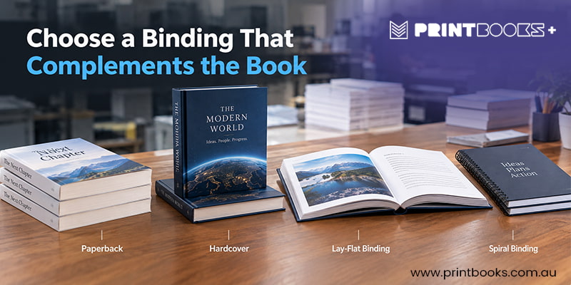
Binding affects both look and practicality.
Paperback gives you a clean, flexible format for novels, reports and most general publications. Hardcover feels more substantial and suits premium publications, reference books, or anything meant to last years on a shelf.
Other binding styles suit workbooks, manuals and journals — anything that needs to lie flat or open easily while in use.
Think about how people will actually handle the book. A striking cover matters, but the binding needs to hold up to real use too.
Don't Overlook the Cover
The cover is usually the first physical impression a reader gets.
A professional cover needs to work visually and be properly set up for print — images, colour, typography and positioning all need to line up.
If there’s a spine, get the width and artwork right. Keep important text well clear of the trim area, and account for the full finished format.
For books being sold, the cover’s doing marketing work too — it needs to say what the book’s about and give someone a reason to pick it up.
Consider the Finished Size and Format
Physical size affects more than how a book looks.
Format shapes how comfortable it is to hold, how content fits the page, and how images display. A larger format suits photography and art; a smaller one suits novels or anything meant to be carried around.
Size should fit the content — a bigger page doesn’t automatically read as more professional, and a smaller one isn’t a compromise either.
The right format balances appearance, usability and what’s actually practical to produce.
Proof Everything Before the Full Print Run
Even carefully prepared artwork needs checking before the full run goes ahead.
A proof shows you how the digital file actually becomes a physical object — and it can catch issues with colour, image quality, alignment, page order or how the paper feels.
Read through the whole thing, not just a few sample pages. Cover, chapter openings, photos, captions, page numbers, any important details.
This matters most for books with detailed layouts or heavy visual content — catching a mistake at proof stage is a lot easier than fixing it after the full order’s printed.
Think About the Complete Reading Experience
Professional book printing comes down to bringing all of this together.
Great paper won’t fix bad typography. A strong cover won’t rescue low-resolution images. Excellent printing won’t make the wrong format work.
The best results happen when artwork, paper, colour, size, binding and finishing are all treated as part of one publication, not separate decisions.
Think about what you want someone to feel the moment they pick the book up. Clear and considered, suited to its purpose, comfortable to read and use.
What Makes a Book Feel Professionally Printed?
There’s rarely one single thing that makes a book feel professional — it’s the sum of a lot of small decisions.
Well-prepared artwork, the right paper, sharp images, consistent typography, accurate colour, a sensible format, quality binding — together, these turn a basic printed publication into something that feels genuinely worth keeping.
At PrintBooks, we print books for authors, businesses, organisations and individuals across Australia — novels, cookbooks, photo books, workbooks, magazines, business publications and more. We’ll help you match your finished artwork to the right printing specifications.
If you’re planning a book printing project, get in touch with PrintBooks. Tell us what you need, and we’ll help you produce a book that looks as good as the content inside it.